There's a moment when you're editing a photograph and you convert it to black and white and suddenly it becomes the image it was always supposed to be. The colour version was fine. The monochrome version is right.
That happens more often than you might expect. And it's what drew me, gradually and then completely, to shooting street and urban scenes in monochrome.
Colour can lie
Not deliberately. But colour carries associations and distractions that have nothing to do with what you're trying to say. A red sign in the background pulls the eye away from your subject. A green cast from overhead lighting flattens the mood. A bright yellow jacket on a passing stranger dominates a frame that was never about them.
Strip all of that away and what's left is the photograph — the geometry, the light, the moment. Monochrome forces both the photographer and the viewer to look at the actual composition rather than reacting to colour first.
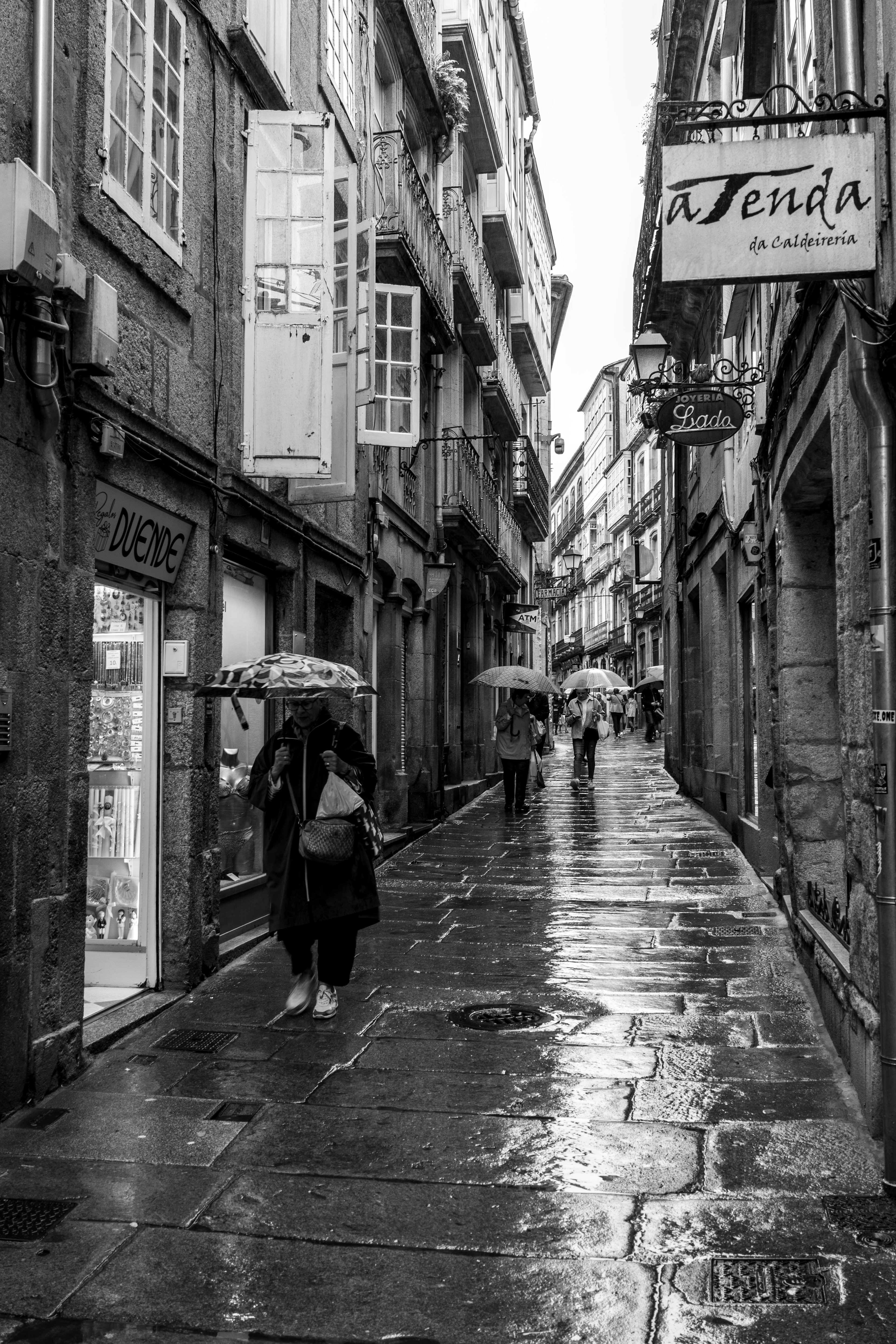
What black and white does to a city
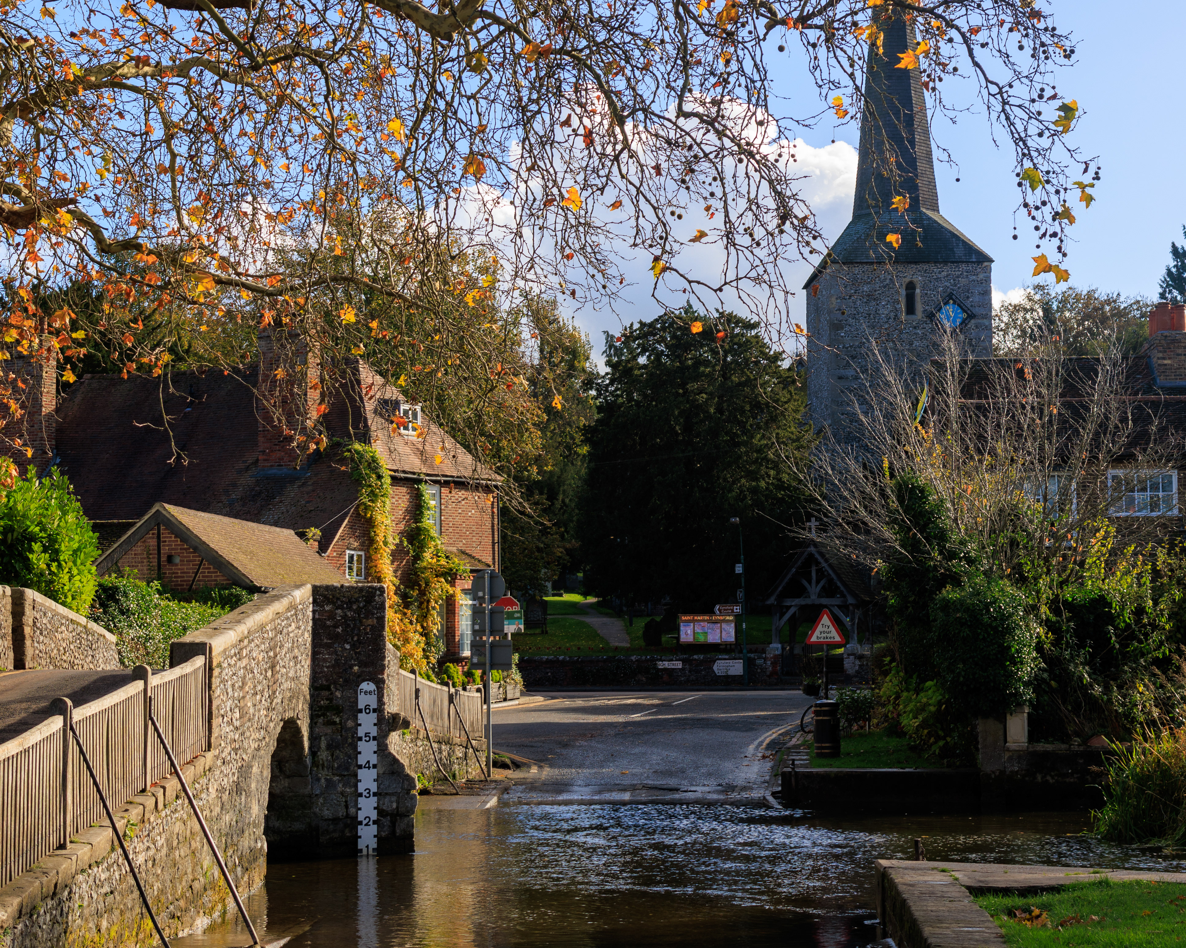
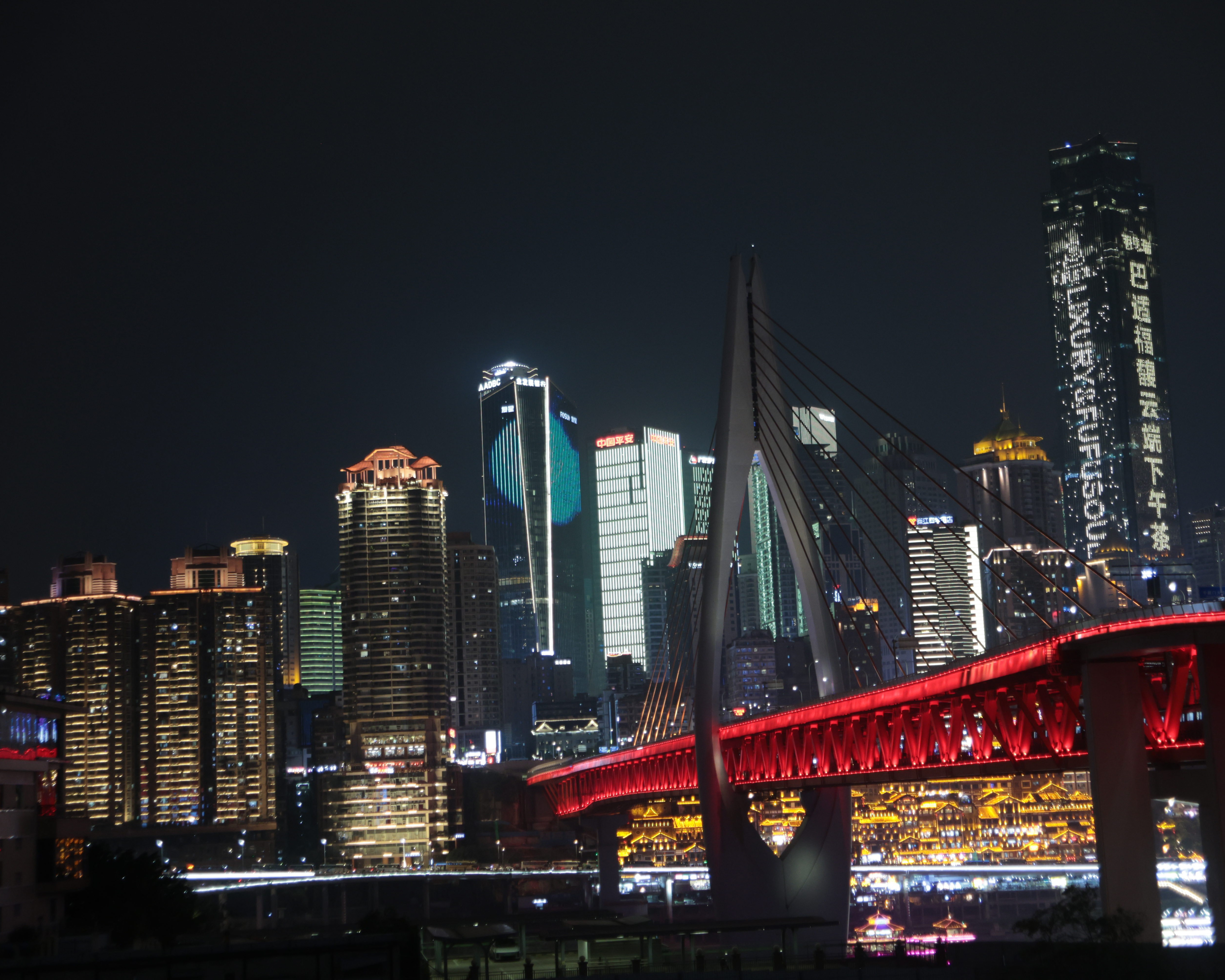
Urban and street photography is where monochrome earns its place most completely, for me. Cities are full of visual noise — advertising, signage, the competing colours of a hundred different shops and vehicles and clothes. In colour, that noise is part of the image whether you want it or not.
In black and white, a city street becomes something closer to architecture. The lines of a building matter. The way light falls across a wet pavement matters. The shadow cast by a railway bridge across a road below — that matters enormously, in a way it simply doesn't when colour is present to distract from it.
Railway stations in particular reward monochrome. The grand Victorian ironwork of a station canopy, the steam catching the light on a heritage line, a platform emptied of passengers in the early morning — these scenes have a natural drama that black and white amplifies rather than invents.
Mood before method
I don't shoot in monochrome because it looks classic or timeless, though it can be both. I shoot in it when the mood of a scene calls for it — when the atmosphere is more important than the colour, when the composition is stronger without distraction, when the subject has a texture or a weight that colour would somehow diminish.
Sometimes I know in the moment that an image will be black and white. The light is flat, the colour is irrelevant, but the shapes are extraordinary. Other times it's only in editing that I realise — this works better without colour. The image is telling me something and I need to listen to it.
A different way of seeing
Shooting more in monochrome has changed how I see in colour too. I notice light differently — not just its warmth or coolness but its direction and quality, the shadows it creates, the way it separates a subject from its background. I notice texture more. I notice composition more.
That's perhaps the most useful thing monochrome photography has given me — not a style, but a way of paying attention.